
Summary
Organizations can expand their markets by making their websites, documents, and videos accessible, following WCAG guidelines.
Marketers must be responsible for accessibility
The goal of marketing is to reach as many people as possible and expand your market share to include everyone you possibly can. Be sure to include people with disabilities who make up as much as 25% of the market. A 2018 report from the American Institutes for Research (AIR)—A Hidden Market: The Purchasing Power of People With Disabilities, found that “the total after-tax disposable income for working-age people with disabilities is about $490 billion, which is similar to that of other significant market segments, such as African Americans ($501 billion) and Hispanics ($582 billion).”
Additionally, not only does it matter to people with disabilities whether they can access your content, but it will also matter to their friends and family. Studies show that people care very much about an organization’s corporate social responsibility. Add in the friends and families of people with disabilities, and you’re looking at an even greater share of the market. Failure to provide an equivalent experience for everyone means missing as much as 25% of your market. It can also mean alienating friends and family of people with disabilities, complaints, and even lawsuits. Consequently, content creators must take responsibility for the accessibility of the materials they create.
Many features designed for digital accessibility are extremely useful to your entire audience. One example is closed captions for videos. Captions were originally implemented for people with hearing disabilities. However, studies show that 80% of people who use captions aren’t deaf or hard of hearing, and 1 in 3 people use captions in a public setting. Not only that, adding captions and transcripts to your videos will augment your SEO.
Accessibility involves a great many factors, so here are some best practices for websites, documents, and videos. Follow these recommendations to ensure content is accessible and expand your market to include your entire target audience.
How do you know your message is accessible?
WCAG. The World Wide Web Consortium publishes (and updates) a set of guidelines for making all kinds of content accessible, called the Web Content Accessibility Guidelines (WCAG). The basis of these guidelines are four basic principles– Perceivable, Operable, Understandable, Robust. Check your content against these guidelines to ensure it is accessible.
Accessible Websites and Documents
People with disabilities often use assistive technology to help them access digital information. Chances are, most of the content marketing teams create is digital. Make all content readable and accessible by assistive technology in order to include everyone.
Navigation
One of the largest barriers to information for assistive technology users is navigation. What a sighted person sees on a webpage or in a document isn’t necessarily what assistive technology sees. Apply digital coding to allow the assistive technology to read the information that is visually seen on the screen. Expand your market with navigable, accessible content.
Reading order
On a busy webpage or document, the order the content is read can make a large difference in how it is understood. Label all elements with the correct information regarding the order they should be presented to an assistive technology user.
A PDF, for example, requires that all elements are labeled with a reading order to ensure the content is presented correctly. Picture a busy magazine page with multiple articles on a page. You’d see it has multiple columns of text various call-outs from the articles and advertisements. With that, you can see how reading order would be very important to someone who cannot see the page. Without digital tags, assistive technology would read text from top to bottom, left to right, regardless of where one column or article ends and another starts.
The commonly seen tri-fold brochure presented in digital format is another example where reading order is paramount. Often the “front” of a brochure appears in the far-right column when presented digitally. Without proper reading order set, an assistive technology user would read read left-to-right, top-to-bottom by default. This means they’d read the back of the brochure before the front. Properly identify reading order for web pages, presentations, and other long-form content.
Headings
Headings help break up content into digestible sections. This allows people to quickly understand what is contained within the document, webpage, presentation, or email. Assistive technology users can set their technology to just read through a list of the headings in a document like a person visually accessing information skims through the headings visually.
Headings also allow the reader to easily find specific information. Without headings, a 20-page PDF download of, for example, PDF Accessibility Techniques for a marketing campaign, is just a 20-page block of text. An assistive technology user attempting to find information within that same document about adding form fields to a PDF would have to read every single word on every single page up to the point where they discover the form fields section. Apply digitally tagged headings so assistive technology users can quickly read through the headings to find the needed information.
Using a change in font, style, or size alone will not help an assistive technology user to understand which items are headings. A digital heading tag is required.
There should only ever be a single Heading level 1 in any web page or document- the title. Do not use the “title” feature in any document creation tool – they are not read as Heading level 1 by assistive technology. Nest the heading levels correctly, so readers know that items that are Heading level 3 are part of a larger section under Heading level 2.
Use Headings in most content including one-pagers, web pages, documents, and presentations.
Links
Best practices for links apply to all users, including sighted users. Label links with text indicating the destination, and embed the link into the text. Don’t just post a URL. “Check out our webinars” is better than “Check out our webinars https://equidox.co/resources/webinars/.”
Buttons should also be clearly labeled. Buttons leading to the same location should have the same label. “Buy now” should not be replaced with “Add to Cart” on the same page if the function is the same.
Similarly, links that go to different destinations shouldn’t all have the same label. A webpage full of blog article links shouldn’t have buttons that are all labeled “Read More.” Assistive technology users often set their assistive technology to show all “active elements” on a given page. This will read a list of just the links on a page, and isn’t usable if they all say, “Read More.” A better solution might be to embed the link into the title of the article, or make the button text more specific, like “Read WCAG article” and “Read alt text article.”
Images
Images are engaging and can present complex material succinctly. But without a text description, assistive technology can’t identify what they are or why they are important. If you’ve ever accessed a web page to find the image won’t load, you can understand the frustration of being unable to know what information you’re missing when you can’t see the image.
Apply a text alternative (alt-text) to every image to provide an equivalent experience for all viewers. Make your alt text description brief, specific, and within context. For example, in an ad for fast food, describe the food, not the colors of the packaging. For an ad for clothing, however, include descriptions of the colors and materials.
Almost anywhere there is an image it should include alt text. If you want to learn more about applying alt text, check out this webinar and this article.
Using Color
Using color to convey meaning is fairly common in marketing. But that doesn’t help people who are colorblind (between 5 and 10% of the US population), people who have low vision, or people who can’t see at all. You need to find ways to convey that meaning alongside any color choices you make.
Color Contrast
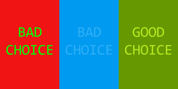
Accessible color contrast is not just for people with disabilities. It’s also best practice for your entire audience. They could be color blind, or have low vision, but they might also be sighted users viewing your material in a glare-y or dim environment. It’s not always easy to tell what acceptable color contrast is, but you can easily check that with any number of free color contrast checkers.
Some examples of good and bad color contrast are shown in this image:
Alternatives to Color
In order to convey meaning without using color, or in addition to using color, use bold fonts, underlined format, headings, and quotations. Italics isn’t recommended as it can make readability poor for people with low vision or dyslexia. It’s fairly common to make all links on a webpage or in a document blue while the remainder of the text is black. Simply add an underline to convey meaning. This serves the same purpose and provides an equivalent experience. It also increases the chances more people will click your link, and best convey your intended message.
Non-mouse users
Many users cannot use a mouse to interact with digital content. They may be blind or have low vision, or they may have mobility issues. In those cases, an alternative such as a keyboard, joystick, refreshable connected Braille display, or other specialized tools may be used to interact with the content. They may be accessing your content on a small screen or be unable to double-click or even activate or focus on a small button or tiny area containing a link.
Ensure your users can interact with your content whether or not they are using a mouse, including buttons, links, and form fields. To this end, making content “keyboard accessible” works with most tools and technology. Nearly all tools used to access digital content expect to interact with the keyboard in some way, so if the content is keyboard accessible, most likely it will be accessible to anyone regardless of how they are interacting with the content.
Creating keyboard-navigable content may involve coding, so work with your website’s developer to make sure it’s built-in. Expand your market by making sure your content is accessible no matter what tools are used to interact with it.
Clear Language
Write your content in clear language and avoid jargon, slang, unexplained acronyms, and other language that might difficult to understand. Remember, one of the pillars of WCAG is “understandable.”
Accessible Videos
Video is used widely in marketing to convey ideas, share brief product information, and introduce your brand and products. Expand your market using accessible videos that allow everyone to consume your content.
Captions
Provide captions for even brief marketing videos. It’s even better if you also provide audio descriptions for people who are blind or have low vision. Captions simply provide any audible information contained in the video as a text banner at the bottom of the screen. Outsource your captioning, type it yourself, or use auto-captioning now featured by video services and video editing software.
YouTube’s auto-captioning is actually quite sophisticated. However, don’t rely entirely on auto-captioning to convey your message to the users who can’t listen to it aloud. Auto-generated captioning makes a great start, but can also make mistakes. Be sure to review for accuracy. Auto-captioning has misinterpreted the name “Equidox” as “equinox,” “equi docs,” and a personal favorite, “aqua dogs.”
Edit captions directly in your video editing program or YouTube. Or copy the auto-generated captions, or download them as a .srt, .vtt, or .txt file, into a document and edit them there.
Audio Description
Audio description adds audible commentary to videos that help provide an equivalent experience for people who are blind or have low vision. It provides information about the video and the action going on that is not conveyed by dialog, music, or sound effects. Take a look at this video clip of The Lion King to see a good example of how to provide audio description.
Audio description is not readily available on some web pages or social media platforms without an accessible video player. Help include everyone by making sure your video conveys its intended message both visually and in the script heard aloud. Ensure everyone is included in your messaging with thoughtful writing. Avoid videos that just show a series of non-text images with a music track – that will exclude people who cannot see the ad, but who may want to hear your message.
Accessibility is as necessary as proper grammar
You wouldn’t publish content full of grammatical errors. It would be embarrassing and damage the reputation of your brand. Likewise, integrate accessibility into content creation just like you would with good grammar. Use accessibility to expand your market by internalizing accessibility best practices when producing content. With practice, it will become second nature. Following these best practices, reach everyone in your target audience and expand your market to include everyone in your messaging.
Keep an eye out for Part 2 of this article, which will cover how to expand your market with accessible social media and email best practices.
Tammy Albee
Tammy Albee | Director of Marketing | Equidox Tammy joined Equidox after four years of experience working at the National Federation of the Blind. She firmly maintains that accessibility is about reaching everyone, regardless of ability, and boosting your market share in the process. "Nobody should be barred from accessing information. It's what drives our modern society."

Ready to make your PDF documents accessible? We can help!
Speak with an expert to learn how Equidox solutions make PDF accessibility easy.