Automated checkers miss a lot
One of the most frequently asked questions about PDF accessibility is how to check whether the PDF document is actually accessible. Many people use automated PDF accessibility checkers to help determine if there are errors within their PDF documents. However, automated checkers can only check a fraction of accessibility issues. They can miss as much as 75-80% of errors. That’s because not all aspects of accessibility can be verified by a machine. There are some elements that require a human to determine whether or not they are accessible for someone using assistive technology.
Obtaining a passing report from an automated checker is a great start to validating the accessibility of your PDF document. Correct the machine-identifiable errors first, then it is necessary to conduct manual checks, especially using a screen reader, to ensure accessibility. Here are some errors that automated checkers miss:
1. Alt text
Lack of adequate alt text is the most common issue assistive technology users face in PDF documents. A machine can verify whether or not the alt text field for images in a PDF document contains an entry. PDF accessibility checkers cannot verify whether that entry is correct and complete, or whether it fully conveys the information intended to be contributed by the image.
For example, what is meant to be conveyed by this painting of George Washington crossing the Delaware? Is it part of an article about American history? Is the PDF about paintings? Or about George Washington? An accessibility checker will give a passing result for the letter “Q” because the field is not empty. The purpose served by including this image in the document will change how the alt text is written but no machine can determine what alt text should be to provide a meaningful pass or fail result.

For more information on creating usable alt text for images, charts, and graphs, check out this article: Beyond Basic Alt Text.
2. Decorative and repetitive content
Not all images require alt text, nor should all text content be tagged. Often documents are designed with decorative or space-filling images that serve only aesthetic purposes. Documents might also contain repetitive images and/or text that aren’t needed to understand the content. Often these can be found in the header or footer. Someone using a screen reader might hear, for example, “Company logo” and the document title at the beginning of every page of a document with a logo in the header. This is repetitive, unnecessary, and disruptive to understanding the content of the document.
Repetitive or decorative images and text can’t be “automatically skipped” by assistive technology unless they are “artifacted.” Tag unneeded text and images as “artifacts” to hide the content from assistive technology so it is skipped and not read. Automated PDF accessibility checkers cannot determine whether or not content is necessary. Only a human can do that.
3. Reading order
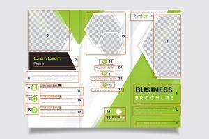
In our 2022 survey, Equidox learned that nearly 70% of assistive technology users encounter reading order errors in PDF documents. Not all documents are laid out in a left-to-right, top-to-bottom reading order. Many contain columns of text, like a newspaper, or text arranged in an unintuitive way, such as a magazine layout. When the content of a page is presented incorrectly, meaning can be lost or obscured by jumbled words and paragraphs. The image below shows the correct reading order for a tri-fold brochure. PDF accessibility checkers cannot determine the correct reading order unless it is told how the page is arranged. It requires a manual check by a person who can understand how the content is intended to be read. Set the reading order on each page so that the content is read in the intended order.

4. Heading structure
Many assistive technology users employ heading structure to navigate a document. Assistive technology can be set to read through only headings in a document to skim the contents and find what they need. An automated checker can determine whether or not there are headings, and whether the structure is “logical,” (meaning the heading levels are nested correctly and don’t skip a level 4 to get to a level 5).
What a checker cannot determine is whether the heading structure is sufficient. For example, a document with only a single heading at level 1 does contain a heading, and no levels have been skipped. Checkers also cannot determine whether objects that should be headings actually are, if bolded text which is not a heading has been incorrectly marked as a heading, or if headings have been skipped or set incorrectly (such as a heading 3 that should be a heading 2). Carefully review the heading structure for the entire PDF to be sure it makes sense.
5. Link context
In any document, ideally, links should be active – meaning you can click on them to visit the link without having to copy and paste the link URL into the browser. Not all guidelines require this, but this provides the best user experience for all users, not only those with disabilities. Additionally, links should not appear as a URL but as text announcing specifically where the link is going.
For example, this URL: https://equidox.co/resources/accessibility-education-tools/facts-about-digital-accessibility/ should be written as Digital Accessibility Fundamentals. That way, everyone can tell where the link leads, and there isn’t a long nonsensical URL for someone to have to parse in order to understand where the link will take the user. Link text should be as descriptive as possible. Accordingly, Email Us is better than Contact Us when using an email address link. Checking that link text conveys meaning clearly is not something automated PDF accessibility checkers can accurately perform.
6. Language
An automated checker can determine if a language attribute exists in the document properties. Some checkers can determine whether characters used in a tag exist within the specified language (i.e traditional Chinese letters within a tag set as English). But if a document is bilingual, or contains contact information in multiple languages, checkers cannot determine if the language that is set matches the language of the text. These discrepancies lead to errors such as “Frenglish,” where a screen reader tries to read French words in English. Set language attributes not only for the whole document but also correct the language for any change in language within the document.
7. Use of Color to convey information
It is often tempting to use color to convey meaning in PDF documents, especially with charts and graphs. This can lead to accessibility challenges that cannot be detected by an automated checker. 1 in 12, or about 8% of men, and one in 200, or about 0.5% of women are color blind. Additionally, many people who have low vision do not perceive color very clearly, and people using low contrast or monochrome displays will be unable to detect the color difference. This does not mean color shouldn’t be used, but it does mean some other method of conveying the meaning intended by the color choices should also be employed.
In this image, the left uses color only to indicate “required fields.” On the right, both color and an asterisk indicate the required fields. The right-hand image is accessible. The left one is not.

In this second example of a calendar, available days are green, while unavailable days are red. Someone with red/blind colorblindness or who is using a monochrome display will be unable to determine which days are available. Some additional information must be provided to allow all users to understand which days are available.

One further example is that links should not be indicated solely by a color change, but also by another method, such as an underline, to indicate that text is a link. Be sure to use a secondary method of indicating links so that someone who cannot clearly perceive color can perceive them within the text.
8. Tooltips for forms
Form fields are often an accessibility challenge. Because of the way assistive technology (AT) uses the Tab keys to navigate digital content, it accesses fillable forms in two separate ways.
Reading Mode vs Edit Mode
The first is Reading Mode, which reads all the visible information on the form (including the field descriptions). The second is Edit Mode, which allows the assistive technology user to fill in the field(s). These two modes are completely separate from one another. This means that gathering surrounding context to understand what a field wants can be very cumbersome, if not impossible. This is particularly true when instructions for populating a field may exist to the left, the right, above, below, or even on a separate page from the field in question (example: “see completion instructions on the reverse of this form”).
Avoid ambiguity for filling form fields
In order to fill in a form field, the assistive technology user must be in Edit Mode. This means that any field descriptions visible on the form are no longer readable. To convey what is required in a form field in Edit Mode, a tooltip is required. While a machine can determine whether tooltips are present, there is no way for it to determine if the tooltips are correct or helpful. Fields such as “Date” or “Name” may not be specific enough to accurately fill in the field. What date? Birthdate? Start date? How must the date be entered? MM-DD-YY? MM-DD-YYYY? Is the form from a country that requires the date to be entered DD-MM-YYYY? Tooltips are intended to help answer these questions, and a machine cannot understand if they are correct.

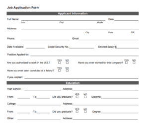
Additionally forms frequently depend upon visual proximity to clarify what is expected in each field. In the above example, instructions on entering your name exist both to the left of the field and beneath it. The checkboxes for employment authorization have instructions both to the left of the checkbox and above it.

In other cases, fields may exist in the middle of running text where context is required from both before, and after the field. Set tooltips for each form field, being sure to indicate any necessary formatting. PDF accessibility checkers cannot ascertain whether this information is correct – only if it exists.
9. Lists
Automated PDF accessibility checkers cannot fully check the accuracy or existence of lists. If list content isn’t tagged as a list, assistive technology will simply read it as text. This is particularly problematic with nested lists because there will be no indication that sublists belong to the parent list items. 36% of participants in our 2022 survey mentioned lists as one of the most problematic elements in PDFs. Be sure to carefully tag all lists including any child lists and items so they are read properly by assistive technology.
10. Tables
Our 2022 survey also reported that 75% of participating assistive technology users had issues with tables in PDF documents. Without proper table tags, text that should read as a table will be read as an indecipherable jumble of words. Additionally, row and column headings are not associated with cell data, and the intended meaning is obscured. Many financial tables include multiple levels of column headers, the year, and quarters. Tables like this require multiple levels of column headers. A checker will give a passing result to a table with multiple headers if it has any headers at all, even if it only contains row headers and none of the required multiple levels of column headers. Set all headers for rows and columns and associate all cell data with both the column and row headers in order for assistive technology users to be able to fully understand the data presented.

Include a table summary that contains any additional guidance or information that will help a user understand the table’s structure and usage such as spanned cells. While automated PDF accessibility checkers can verify that a table summary exists, they can’t determine if it is correct.
Beyond the checklist: Usability
Once you’ve employed an automated PDF accessibility checker and the necessary manual checks to ensure your PDF is accessible, it’s time to address usability. According to the Worldwide Web Consortium, “Usability is about designing products to be effective, efficient, and satisfying. Usability includes user experience design. This may include general aspects that impact everyone and do not disproportionally impact people with disabilities.”
Usability is best addressed during the design/authoring phase. However, often when remediating a PDF to make it accessible, there isn’t an option to rethink how the document is created. When solving for accessibility, try to find the simplest and most straightforward resolution that will include all users. For example, some images might be best served by the alt text that reads “refer to data table on page 5.” Certain complex tables might be easier to understand if they are broken into multiple smaller tables.
If you’re not sure how accessible or usable a document is, try asking people with disabilities to review your document and incorporate their feedback.
Tammy Albee
Tammy Albee | Director of Marketing | Equidox Tammy joined Equidox after four years of experience working at the National Federation of the Blind. She firmly maintains that accessibility is about reaching everyone, regardless of ability, and boosting your market share in the process. "Nobody should be barred from accessing information. It's what drives our modern society."

Let’s talk!
Speak with an expert to learn how Equidox solutions make PDF accessibility easy.
